WiscIT - Matrix Widget
What is a Matrix Widget
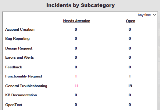
WiscIT allows for the creation of Matrices, which are highly configurable and will dynamically display data depending on its configuration. When placed on a dashboard, if the column is returning a list of records, users can click on the number to go to the list of records. Matrix Widgets can also have calculated columns, which can use other columns in order to calculate data like percentages or dollars.
Creating a Matrix can be an arduous task, but if you think it would fit your workflow, feel free to email wiscit@doit.wisc.edu for assistance.
Creating a Matrix Widget

Configuring Rows
- Create a New Widget that can be edited by following these steps: WiscIT - Dashboard Overview.
- Give the widget a descriptive Name, and select Matrix as the Type.
- Select the Default Business Object. This will be the type of object that you want to matrix to show the user. In this example, we will want to display the number of Incidents.
- Select the radio button for "List of rows come from a field". This will allow us to return results based on field values, rather than based on dates. However, if you want to return the number of business objects based on date, you should use the other radio button.
- Using the three dropdown menus, determine what rows you would like to appear.
- Business Object: We could use "Incident SubCategory" Business Object if we want to have incident subcategories show up as rows. If we wanted team members to be the rows, we can use the "UserInfo" Business Object
- Field: This is the field that will display from the business Object. If the business object was set to "UserInfo", we could use "Full Name" as the field to display.
- Order By: This determines how the rows will be ordered from top to bottom.
- Select "Limit Rows". This will allow us to restrict the rows to a specific set. For example, your dashboard probably doesn't need to display every Incident Subcategory, just the ones that relate to your team or interest. Press the three dots and then create a new search that will return only the objects that you are looking for. For more information about making searches, see WiscIT - Building Searches.
- Select the "Columns" tab. Here we will be able to configure each individual column.
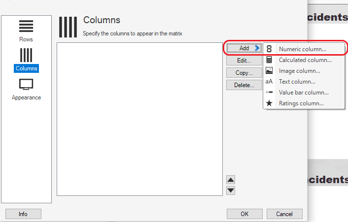
Configuring Columns
- Select the Columns tab on the left had side of the configuration window. Then Select "Add", and then create a new "Numeric Column..."
- Give the numeric column a name, and then select the Business Object you would like to use. We recommend using the same one specified when the widget was created.
- On the field to split incidents between rows dropdown, select the field that you are using in "Rows" to split up your business object. For example, if your rows are incident subcategories, you would want to split the incidents by subcategory in this dropdown.
- Define the Search Criteria that will return a list of Business Objects by clicking the magnifying glass or (...). For example, we could return any incident that has a flag.
- Press "OK".
- Press "OK" again, or add any other columns that you would like to. You can also add calculated columns along with other various types, but they are beyond the scope of this document. Add the Matrix to a dashboard and see if it works!
Additional Configuration Options
There is a lot more to the Matrix than was described above. If you are looking for specific information related to a setting, please expand the collapsible window below
Show Additional Configuration Information
Some content to be displayed inside panel one. This content will be shown/hidden as the panel is toggled.
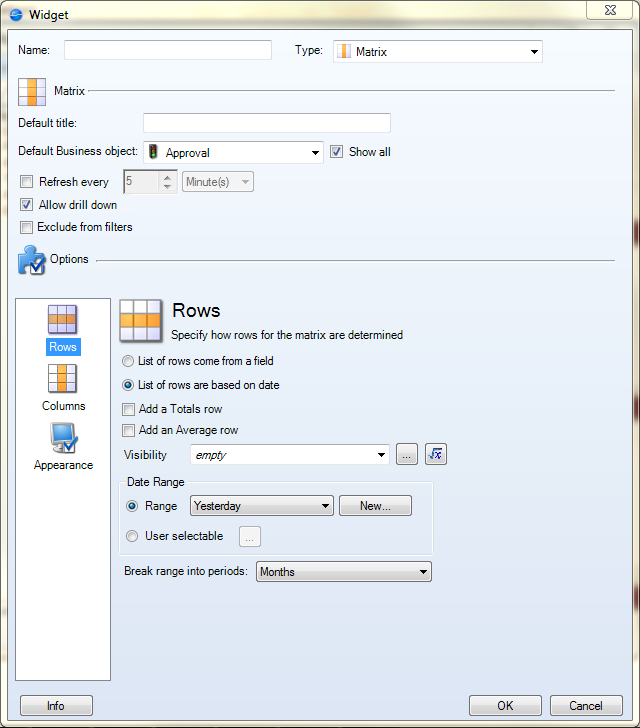
The Matrix widget window is divided into two areas, Matrix and Options.

Matrix: The top Matrix area is where the basic settings of the widget are set.
- Default Title: This is the title used on the matrix when the widget is used in a dashboard. It does not necessarily have to match the contents of the "Name" field at the top of the window.
- Default Business Object: Use this to decide what Business Object is used by default for the columns of the matrix. The selection of this business object does not limit the business objects that can be used in the columns of the Matrix.
- Refresh Every [#] [Time Period]: Set the widget to refresh at certain intervals to keep the information up to date if the dashboard is not refreshed in that time period.
- Allow Drill Down: This option toggles the option to allow drilling down to the results of the searches.
- Exclude From Filters: This sets the widget to not be affected if a filter is used in a dashboard.
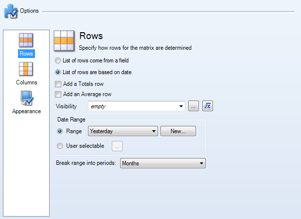
Options: This is where the the more specific settings of the Matrix are set.
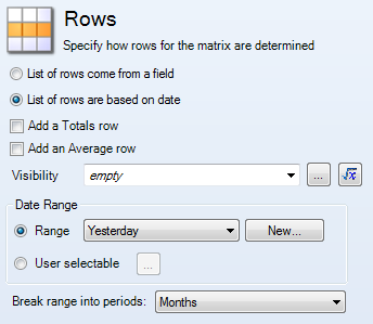
- Rows: This specifies how rows for the matrix are determined.
- List of Rows Come from a Field: This makes the list of rows come from the field of a business object. When this is selected, the "Field for List of Rows" area appears below the visibility field to make the selections.
- List of Rows are Based on Date: This makes the list of rows come from a date or date range.
- Add a Totals Row: Check this box to add up the results in a column and total them in a row at the bottom of the widget.
- Add an Average Row: Check this box to average the results in a column and show this in a row at the bottom of the widget.
- Visibility: This decides the visibility of a certain row, decided conditionally by a pre-made or custom expression.
- Field for List of Rows: This area only appears when the row source is to be determined by a field from a business object.
- Business Object: Select the Business Object that has the field all the columns need to match.
- Field: Select the field in the Business Object to be used for the column field to match against.
- Order By: Select the field in the Business Object to be used for sorting the rows. The checkbox to the right decides if the results should be ordered in ascending or descending order.
- Limit Rows: Check this box to use a custom or pre-made search to limit what rows appear in the matrix.
- Limit Values by Date/Date Range: This area appears regardless of the row source (date or field).
- Range: Limits the row results by a certain date or date range selected from the drop-down field. A new range can be created with the "New" button to the right of the drop-down field.
- User Selectable: Allows the user of a widget to select the date that limits row results. Choose the user selectable options by clicking the button with an ellipsis.
- Field Used for Date Range: This appears only when the row source is a Business Object field. Select a date field to use as a reference.
- Break Range into Periods: This appears only when the row source is a date. Choose the way to group the rows.
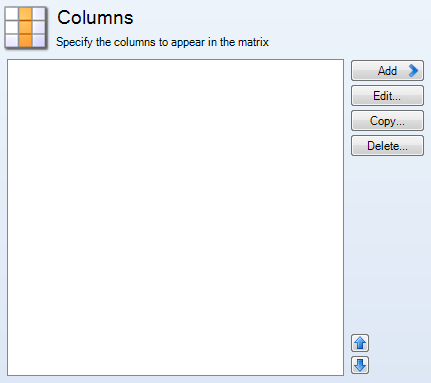
- Columns: This area specifies how the columns appear in the matrix. Created columns appear in the large box and can be selected from there. The buttons on the right create, edit, copy, or delete columns. To change the order of the columns, use the arrow button on the bottom-right of the large box.

- New/Edit Column: Each column has the same top area with the following fields.
- Title: This is the title of the column. It appears if a checkbox in the main widget's Appearance area is checked.
- Fixed Width: Check this box to always have the current column be a certain width.
- Visible: Check this box to have the column visible in the matrix widget.
- Numeric Column: This column shows a number that corresponds to the result of the search criteria intersection (the row and the column).
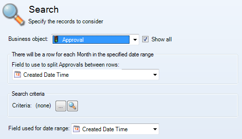
- Search: This area is where the search for the column is made.
- Business Object: Choose the Business Object to be associated with the column. If using a field for the rows, make sure the contents of a field in the chosen Business Object can match the field in the row header.
- Field to Use to Split Approvals Between Rows: Choose the field in the Business Object above that can match the field in the row header.
- Search Criteria: Use a pre-made or custom search to limit what can appear in the
matrix column. See [Link for document 46175 is unavailable at this time] if necessary.
- Field Used for Date Range: Choose a field in the Business Object to use when a date filter is used.
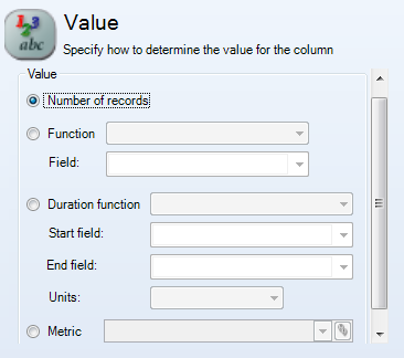
- Value: This is where the primary value is selected.
- Number of Records: This displays a count of the results.
- Function/Field: Uses a different function (average, minimum, maximum, or total), selected from the dropdown and what field of the Business Object is used for that function.
- Duration Function: Uses a different function (average, minimum, maximum, or total), selected from the dropdown. It also has areas to select the start time and end time of the desired duration, along with a drop-down box to select the units the column should use.
- Metric: Select this option to use a Metric value. Select an existing metric from the dropdown. Adjust the selected Metric by clicking on the icon to the right of the dropdown box.
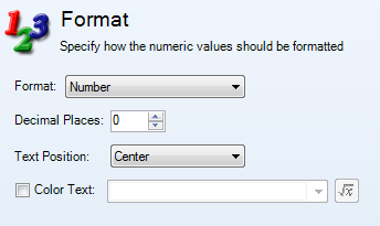
- Format: This area decides how the numeric values should be formatted.
- Format: Choose the format for the result (number, percent, or currency).
- Decimal Places: If decimal places are to be used, they can be set here.
- Text Position: Decide the alignment of the numbers in the column.
- Color Text: Decides the color of a text depending on a specified expression.
- Calculated Column: These use a calculation to find the columns value.
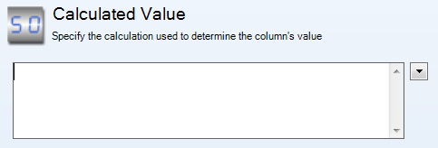
- Calculated Value: Use the triangle in the upper right to find System Functions, Expressions, Stored Values, Metric Values, Counters, or Math Operators to use in the calculation. Other columns can also be used in this calculation.

- Format: This area decides how the numeric values should be formatted.
- Format: Choose the format for the result (number, percent, or currency).
- Decimal Places: If decimal places are to be used, they can be set here.
- Text Position: Decide the alignment of the numbers in the column.
- Color Text: Decides the color of a text depending on a specified expression.
- Image Column: Use an image to appear according to a certain expression.
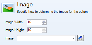
- Image Width: This specifies the specific width of the image used.
- Image Height: This specifies the specific height of the image used.
- Image: Click the expression button to create a custom expression for the column to specify which image appears and when.
- Text Column: Use text to appear according to a certain expression.
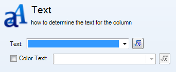
- Text: Click the expression button to create a custom expression for the column to specify the text that appears and when.
- Color Text: Decides the color of the text depending on a specified expression.
- Value Bar Column: Use bars to show the relative status or level of a calculated value.

- Calculated Value: Use the triangle in the upper right to find System Functions, Expressions, Stored Values, Metric Values, Counters, or Math Operators to use in the calculation. Other columns can also be used in this calculation.
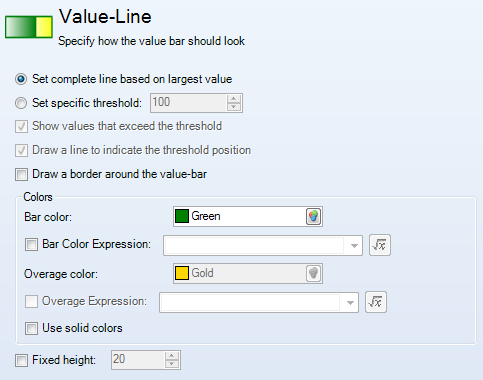
- Value-Line: This changes the appearance of the value bar.
- Set Complete Line Based on Largest Value: This sets the maximum value of the bar to the largest value.
- Set Specific Threshold: This sets the maximum value of the bar to a specific value.
- Show Values that Exceed the Threshold: Check the box to toggle this feature on and off.
- Draw a Line to Indicate the Threshold Position: Check the box to toggle this feature on and off.
- Draw a Border Around the Value-Bar: This shows a border around the entire value bar, regarless of how much the bar is "filled".
- Colors: This sets the colors of the value bars.
- Bar Color: This color sets the main color of the value bar. The checkbox below allows the color to be set by a custom expression.
- Overage Color: This color sets the color of the bar if the level exceeds the specific threshold. The checkbox below allows the color to be set by a custom expression.
- Use Solid Colors: Check this box to toggle this feature on and off.
- Fixed Height: This sets a specific height of the value bar that cannot change.
- Ratings Column: Use images to show a rating to show the relative status or level of a calculated value.

- Calculated Value: Use the triangle in the upper right to find System Functions, Expressions, Stored Values, Metric Values, Counters, or Math Operators to use in the calculation. Other columns can also be used in this calculation.
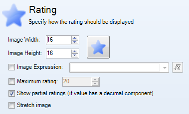
- Ratings: This changes the appearance of the ratings.
- Image Width: This specifies the specific width of the image used.
- Image Height: This specifies the specific height of the image used.
- Image: Open the Image Manager by clicking the big button to the right of the two parts above. This is how the image used in the ratings can be changed.
- Image Expression: Click the expression button to create a custom expression for the column to specify which image appears and when.
- Maximum Rating: This sets a maximum limit to the ratings.
- Show Partial Ratings: Check this box to toggle this feature on and off.
- Stretch Image: Check this box to toggle this feature on and off.
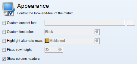
- Appearance: This area controls the appearance of the matrix.
- Custom Content Font: Check this box and choose the font to use in the matrix.
- Custom Font Color: Check this box to choose a custom font color.
- Highlight Alternate Rows: Check this box to have alternate rows be a different color than what is used when the matrix is implemented in a dashboard.
- Fixed Row Height: Check this box to make the row height fixed, not automatically adjusted based on the row results.
- Show Column Headers: Check this box to have the Title of the columns to appear in the matrix.