WiscIT - Individual Chart Series Window
This window appears when a selected series is created or edited.
The Chart Series window looks very similar to the Widget window, with the top section being named Series rather than Chart. It is where the design and function of the series is ultimately decided.
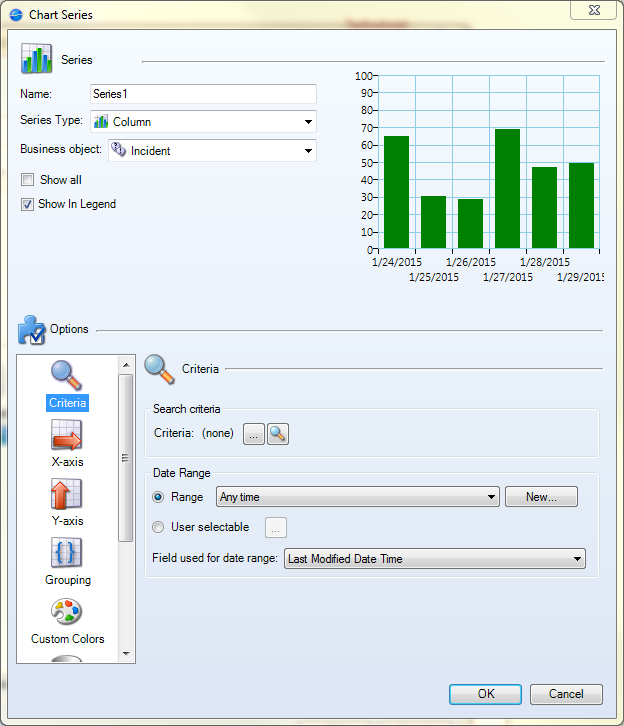
Series: This area looks and functions in a very similar way to the main Widget window.
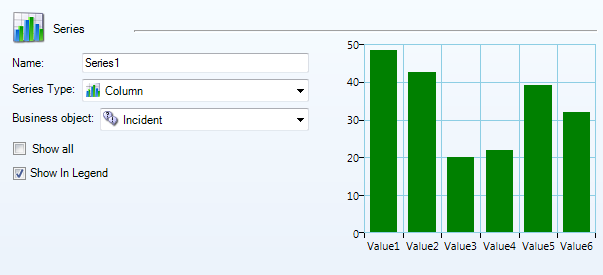
- Name: This is the name of the series, which may show up in the widget if the legend is shown.
- Series Type: These are the various types of series that can be used to visualize the data. The types are bar, column, line, pie, pipeline, and scatter charts.
- Note: Depending on the series that are already in place, this list may be limited, e.g. only an additional bar graph can be used with another bar graph, a column chart can be used in tandem with another column, scatter, or line chart.
- Business Object: Gives a list of the Business Objects the widget can use. To see all possible Business Objects, check the box next to "Show All".
- Show in Legend: Check this box to have the series shown in the main widget's legend.
Options: There are a number of mini-menus in this area, which can be selected in the area on the left. The actual number of mini-menus depends on the series type selected in the Series area of this window.
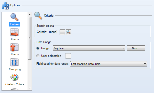
- Criteria: This area is where the actual data to use in the series is selected.
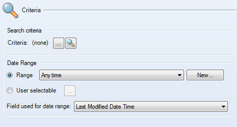
- Search Criteria: A pre-made or custom search can be used to draw data for the chart. The ellipsis button opens the Search Manager and the magnifying glass opens the Custom Query window. See [Link for document 46175 is unavailable at this time] if needed.
- Date Range: This chooses the date range for the widget to work within.
- Range: This sets a date range for the widget to use in any instance of the widget, unless a Filter widget is also being used in the dashboard that would change the date range used.
- User Selectable: Opens a dialog box that gives a range of options a user would be able to select from when using the widget on their own dashboard.
- Field used for Date Range: This gives a field for the widget to focus on when using the date range. For example, if Last Modified Date Time is the field selected and the date range is "Within the last 1 month", the series will show all the tickets that fit the search critera that have been modified in the last month.
- X-Axis: This area is where the Business Object field used on the horizontal axis of a chart is chosen. It is only available for bar, column, line, and scatter charts.

- Y-Axis: This area is where the Business Object field used on the vertical axis of a chart is chosen. It also allows for selection of how that data is visualized. It is only available for bar, column, line, and scatter charts.
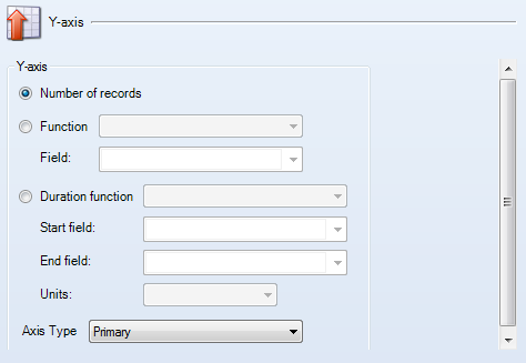
- Number of Records: Uses a count of the results of the search criteria in each point of the x-axis.
- Function/Field: Uses a different function (average, minimum, maximum, or total), selected from the dropdown and what field of the Business Object is used for that function.
- Duration Function: Uses a different function (average, minimum, maximum, or total), selected from the dropdown. It also has areas to select the start time and end time of the desired duration, along with a drop-down box to select the units the Y-axis should use.
- Axis Type: A Y-axis can be set to be primary or secondary if two different series are going to be modeling information on the same chart.
- Slices: This is an option that is only available for pie and pipeline charts, but the way they are configured is quite different.
- Pie Chart Slices: The slices in a pie chart only need to know the field name to draw from in order to visualize information.

- Pipeline Chart Slices: Pipeline slices also need a Business Object field name to use for visualization, but the way the slices are shown is more customizable.
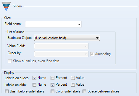
- List of Slices: This area with three drop-down boxes and two check boxes allows the creator to show how the slices are listed. They may be automatically filled in depending on the field name chosen. Depending on the Business Object chosen, the value field and order choices will be limited. Value Field chooses what exactly is shown and Order decides what field the information is sorted by, with ascending or descending being chosen by the check box to the right of the order by field. All values, regardless of if data exists or not, can be shown with the final check box on the bottom of this smaller area.
- Display:
Below the List of slices area is a number of check boxes to turn on and
off labels of the various slices and whether they should be on a slice
or on the side of a slice. The labels can be further customized by
adding dashes, color coding side labels to match the slice, or adding
space between the slices.
- Size of Slices: Like the slices section,
this is also unique to pie and pipeline charts, but the options are
exactly the same as the Y-Axis options for bar, column, line, and
scatter charts.
- Grouping: If data should be grouped together in the chart, it can be done here.

- Group By: When this box is checked, grouping is enabled, with a drop-down box to choose the field to group by and the units that should be used (if applicable).
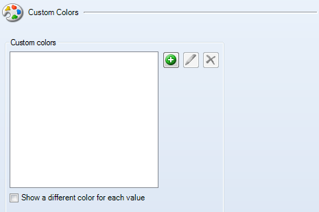
- Custom Colors: Custom colors can be used when a specific X-axis value needs more attention (such as reopened tickets). To add a custom color, click on the new item button, type in the x-axis value that needs to be matched, then select a color.
- Combine Values: This setting allows the data to be combined if the numbers are negligible (i.e. only 1 ticket fits a certain criteria, where 42 fit the a different criteria).
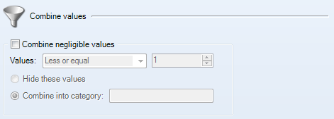
- Values: Set a numerical condition for combination and a number to follow.
- Hide These Values: Make the values not visible.
- Combine into Category: Gives a new category to combine the negligible values into. Can be "Other", "Single Cases", etc.
- Analysis: This area can be used to define analysis formulas, specifically trend lines. These are only available on column, line, and scatter charts.

- Drill Down: Drill-down options are chosen here.
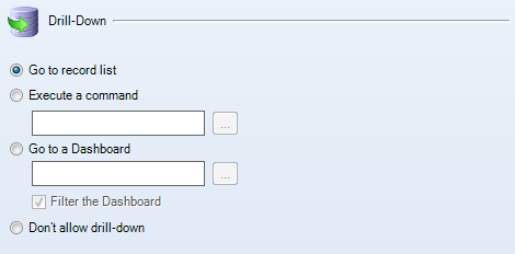
- Go to Record List: This is the most common choice, to have clicking on a segment or point on a chart go to the results that fit the criteria of that point or segment.
- Execute a Command: Have clicking on a segment or point activate a command, which can be chosen from the ellipsis button on the right if this is selected.
- Go to a Dashboard: Have clicking on a segment or point bring the user to a dashboard, which can be chosen from the ellipsis button on the right if this is selected. If the filter box is checked, then filter choices on the dashboard with the widget currently in production will also be used on the dashboard that is being drilled-down to. For example, if the dashboard filter is set to "Within the last 1 week" and a user drills down to the dashboard through this widget, the dashboard will also have the filter "Within the last 1 week".
- Don't Allow Drill-Down: Turns off drill-down options and makes the chart read-only.
